crescendo

Brand Identity
Crescendo
Objective
Crescendo (adverb) — In music, a gradual increase in loudness.
A crescendo is depicted in music theory as a long V on its side, starting with the small end at the left, and opening up to the right.
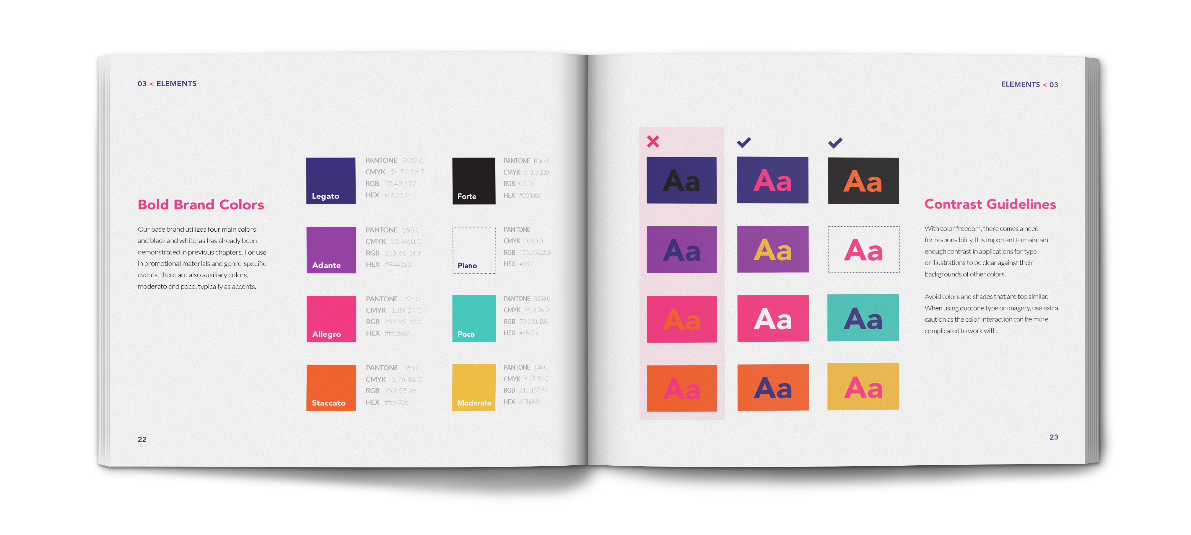
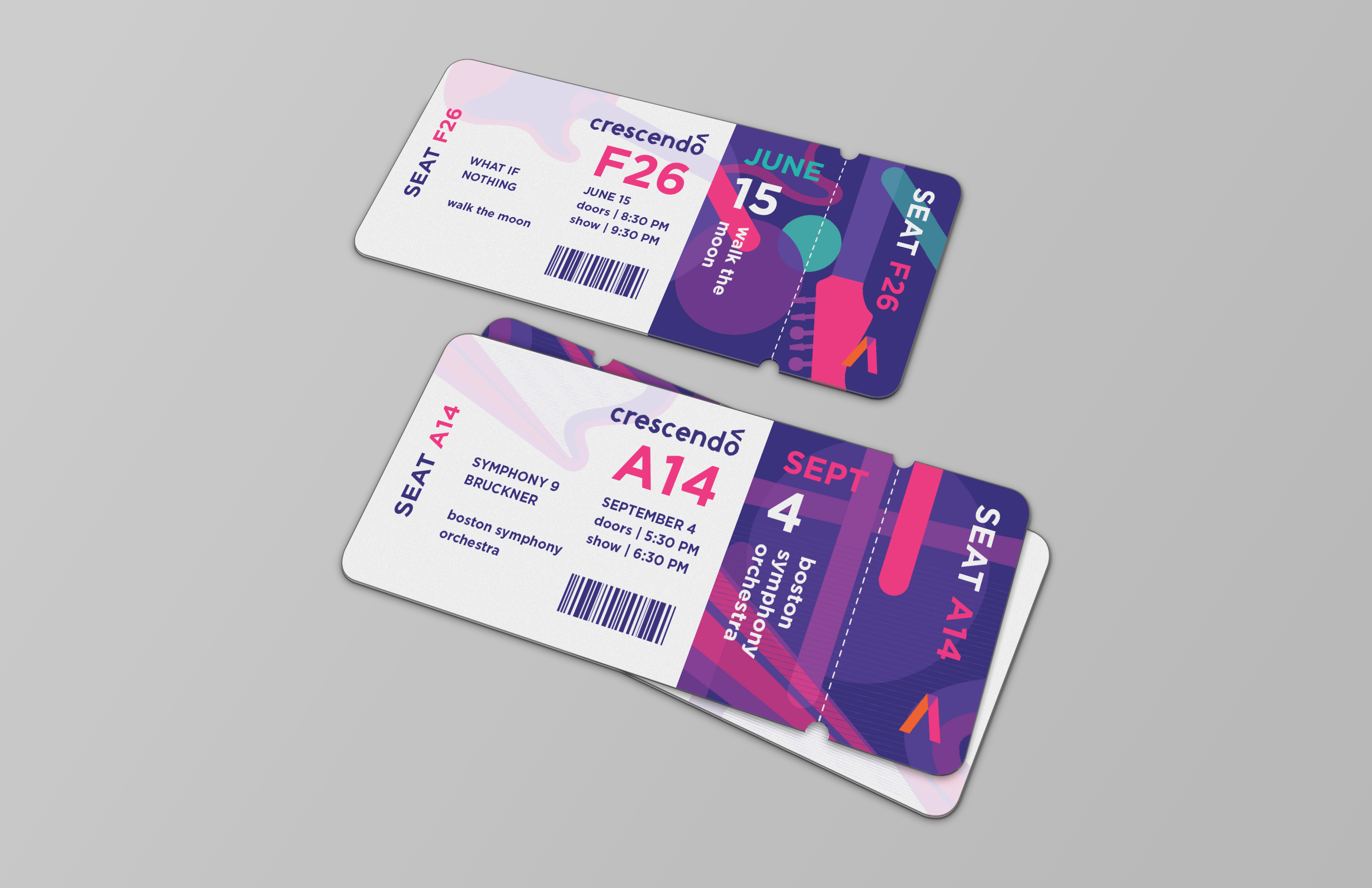
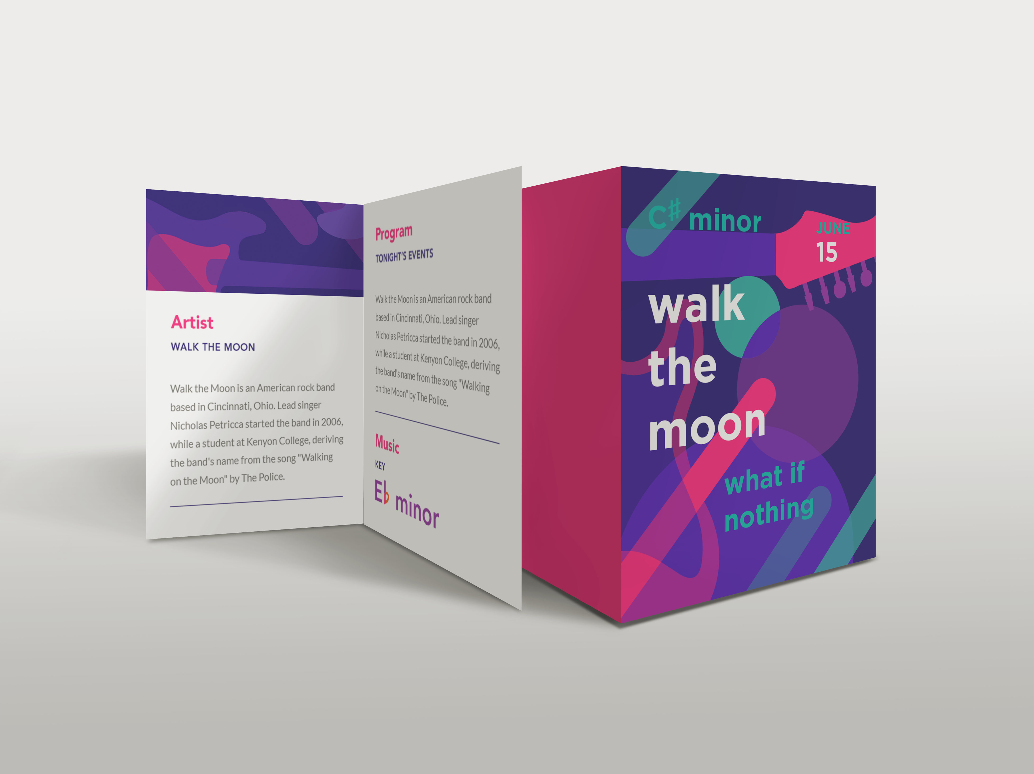
Crescendo is a fictional concert hall that hosts musical events spanning a wide range of genres. Its marketing goals are primarily focused on public-facing promotional materials about upcoming events. For this reason, the ideal brand identity for Crescendo makes clear at a glance where the event is being held, who is playing, and what genre it falls under. Crescendo's visual identity is built around the concept of portraying music visually, using mixed or overlapping colors to represent mixed or overlapping notes — harmony.
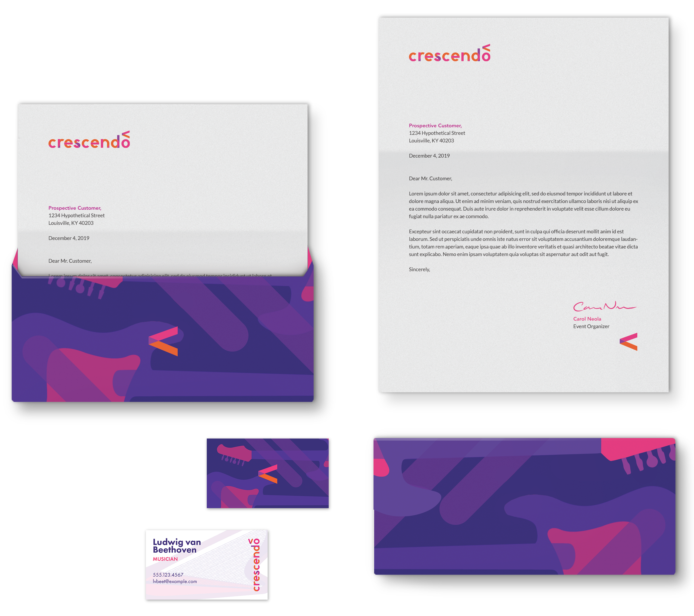
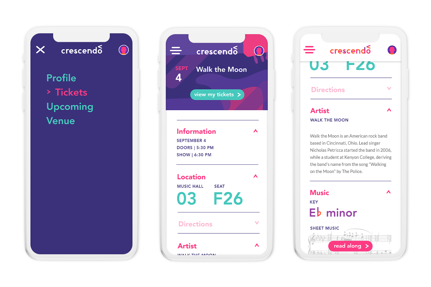
A Branded Experience
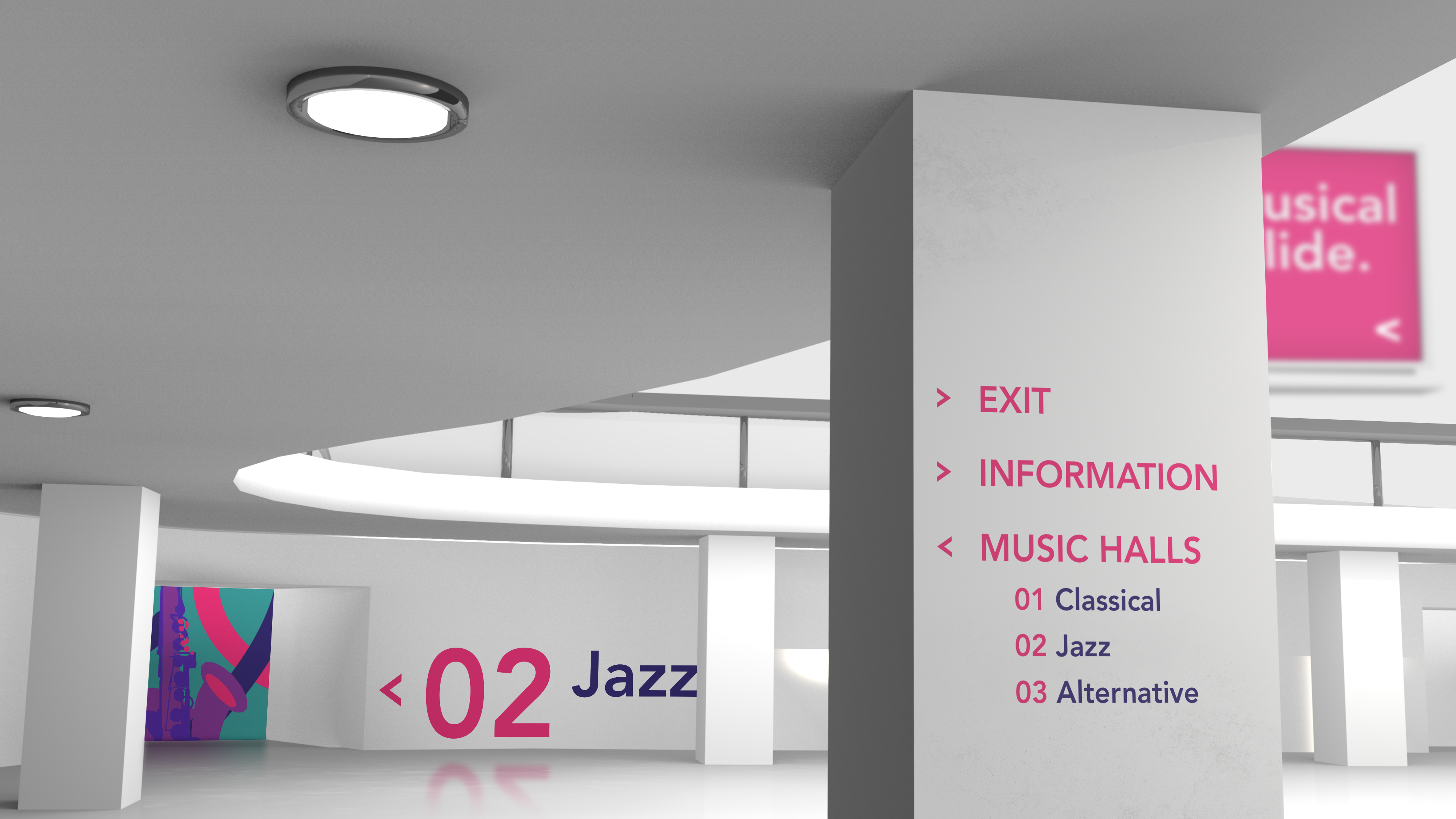
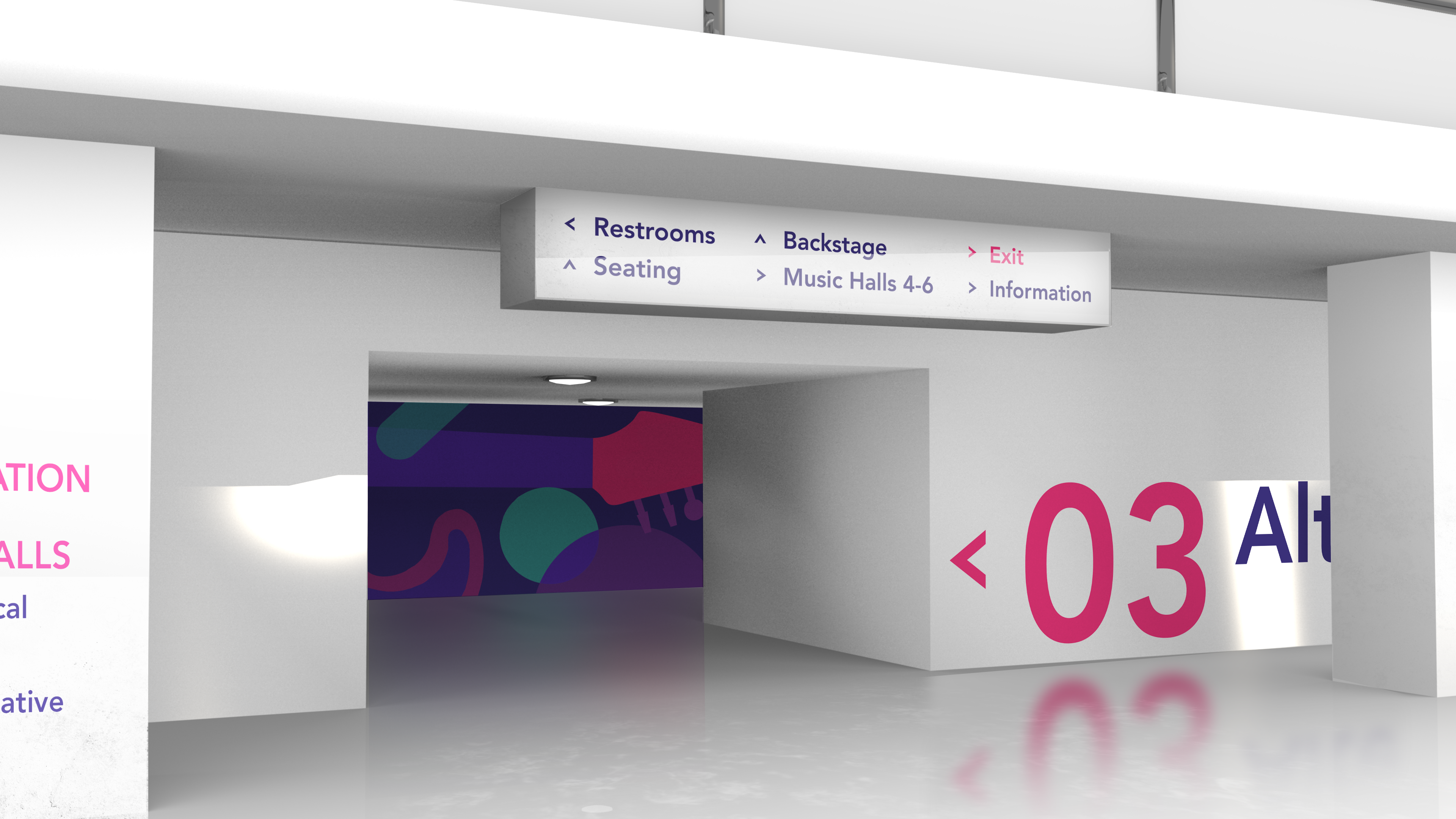
Crescendo aims to affirm its identity as a place that facilitates memorable experiences from the initial buying process until the end of the event — and perhaps even after that. For this reason, the identity continues to be consistent across a variety of media the audience might interact with, from the app to view tickets, to the wayfinding system within Crescendo's campus, to the event tickets themselves.
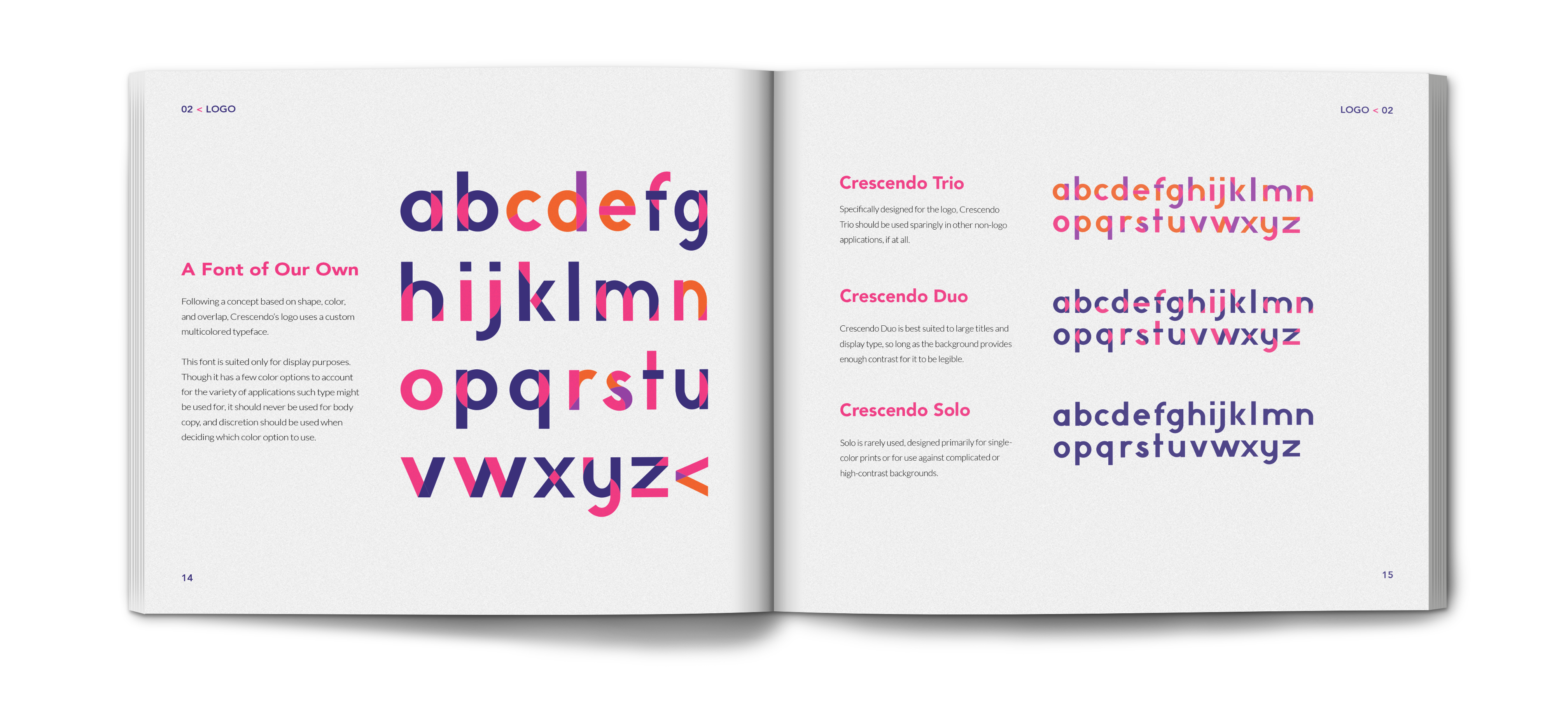
Crescendo Typography
Crescendo's logotype utilizes this same concept of using the overlap of color to represent harmony. Additionally, its geometric letterforms are built almost entirely from lines and elipses, much like music notation.
These fonts are suited for display purposes. Though it has a few color options to account for the variety of applications such type might be used for, it should never be used for body copy, and discretion should be used when deciding which color option to use. It does, however, create a visually striking and unified logo.

Crescendo Trio
Specifically designed for the logo, Crescendo Trio should be used sparingly in other non-logo applications, if at all.

Crescendo Duo
Crescendo Duo is best suited to large titles and display type, so long as the background provides enough contrast for it to be legible.

Crescendo Solo
Solo is rarely used, designed primarily for single-color prints or for use against complicated or high-contrast backgrounds.