susan pallmann design
Documentation
This Site
Objective
This portfolio website was designed and developed from scratch over several months. The addition of many new projects to the portfolio afforded the opportunity to redo the website, and make a number of improvements based on new things learned in the past two years, especially related to accessibility.
Website
Repository
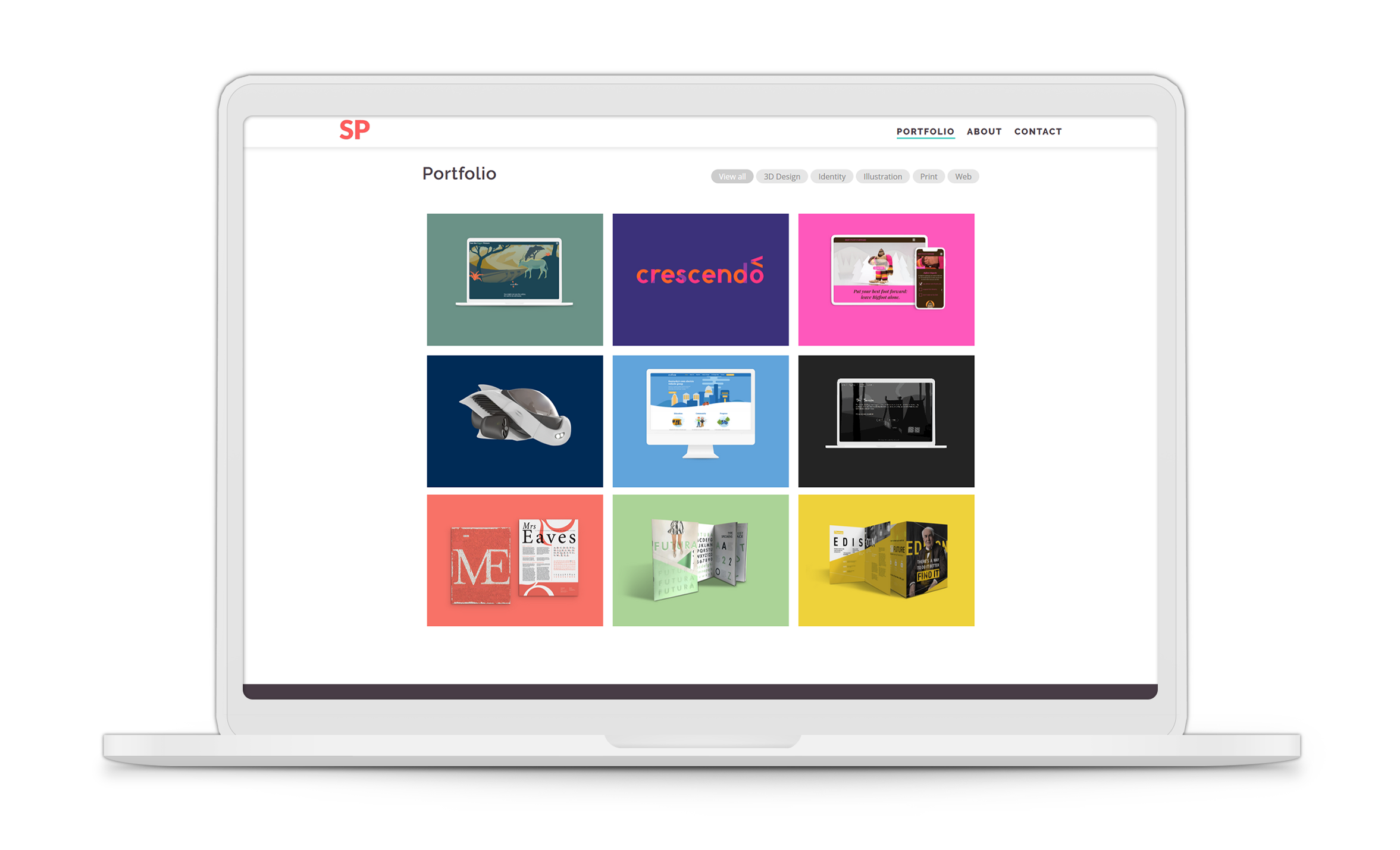
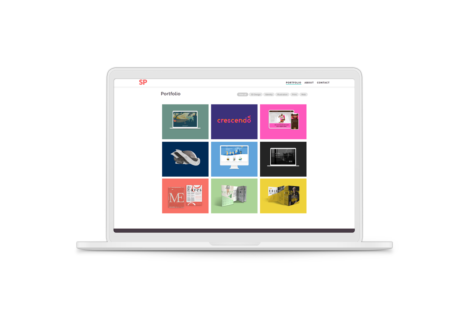
Responsive Grid
Over the last two years and through a handfull of web projects, a personal responsive grid system (similar to Bootstrap) was put together and improved. The base system (modified for this project) has its own repository on GitHub. Like Bootstrap, it is based on a twelve column grid and has several breakpoints. However, many of the web projects it was developed for are small, and don't really require a system as robust as Bootstrap. Most of all, though, the creation of a personal responsive grid allowed for a better understanding of how Bootstrap's responsive grid works.
Organization
A major change in this version of the website is organization. File structures make more sense than they did previously. As the new site is larger and has more pages, it became much more important to ensure there are naming conventions and reliable file directories for adding new project pages. This also led to the addition of a sitemap for SEO purposes.
Accessibility
The greatest improvement in this version of the website is accessibility. Extra care was taken to make sure interactive elements are tabbable and that color/text contrast is strong enough. This version completes Google Chrome's accessibility audit with a score of 96 or higher on all pages. There are also precautions in place in case the viewer does not have JavaScript enabled in their browser.
Better SEO
Another concern in the redesign was Search Engine Optimization, which has also improved drastically (score of 100 on Google Chrome's audit). This was achieved by adding in a number of meta tags and ensuring HTML structure makes sense.
Designed for Change
The original version of this website was designed with much less experience. This required that a new version start essentially from scratch (and that was a lot of work). As a result, this version is designed with future change in mind. New projects will be added, information may change, and new types of pages might even be needed. Every aspect of this site — file organization, stylesheets, and scripts — is designed to hold up under major change.
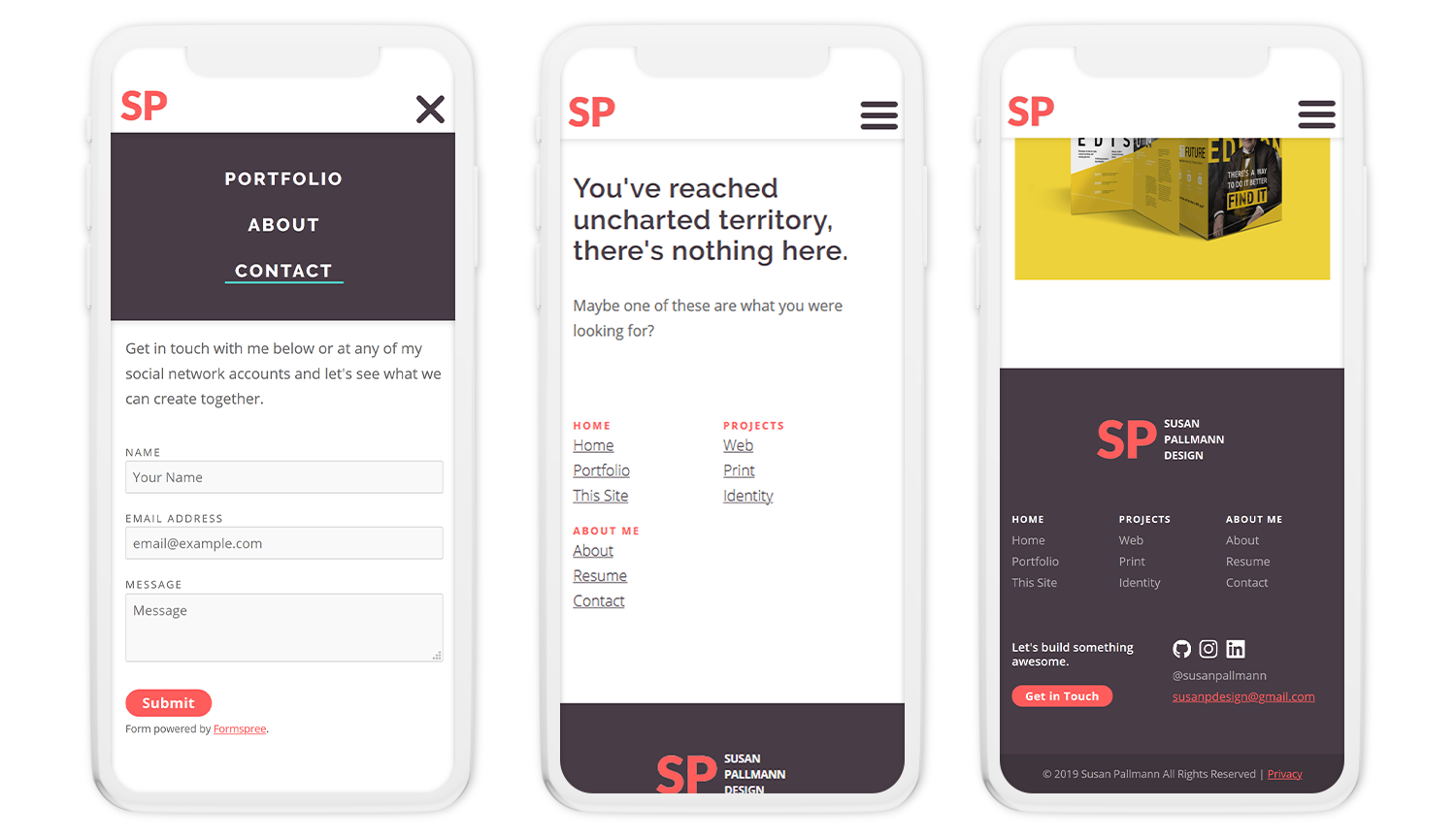
& Designed to Fail Gracefully
Although the hope is that this part of the website is generally invisible, there are a number of ways a website can go wrong. With the addition of 404 handling, fairly wide browser support (yes, even Internet Explorer), and no-script stylesheets, it is intended that should something break, it at least does so with grace.
UI System
A significant focus of this portfolio is web and interactive work, so naturally some level of this interest needed to show through the website. However, the interaction should not take away from the work being shown, so all UI/UX elements were intentionally kept minimal and subtle. The hope was that the website rewards people for being interested — the more one interacts with clickable parts of the website, the more interesting effects they see.
Final Design
Ultimately, this portfolio didn't have to be developed from scratch. Certainly plenty of website builders could have handled many of these issues automatically. However, taking the time and effort to learn to handle accessibility, SEO, and failure has without question made me a better designer and developer. Arguably if the goal of this site is to claim that my passion is web and interaction design, the best way to do so is to demonstrate fundamental understanding of how the tools we use work, and how to design and develop a thoughtful, but simple approach to a portfolio website.
