find care
UI/UX Design
Find Care
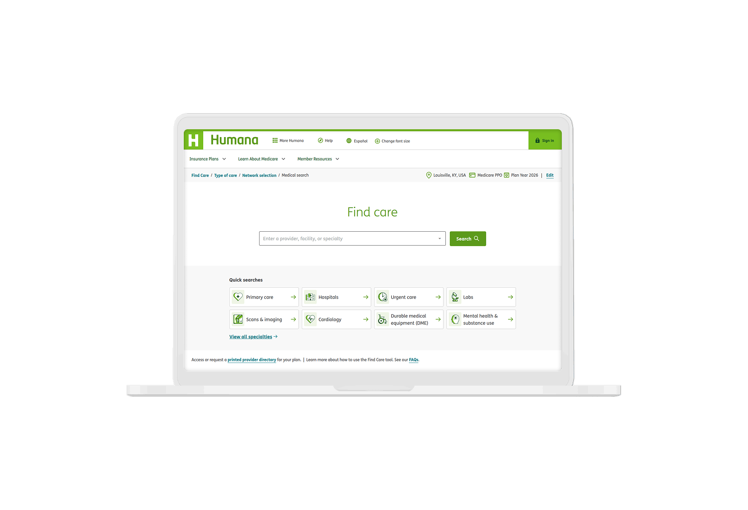
Reimagining Humana’s doctor search experience
Millions of people with Humana health insurance visit the website each year to search for covered medical care. In 2022, that experience was tedious and unintuitive, and many users were unable to reach search results at all.
My team redesigned and rebuilt the doctor search tool from the ground up with usability the first priority. The new search experience improved user satisfaction scores and reduced calls to the customer service call center but most importantly:
It ensured more people are able to find covered care in their time of need.
Website
Date
2023-2026
My role
Lead product design
UX strategy
Research
Design system
A better welcome mat
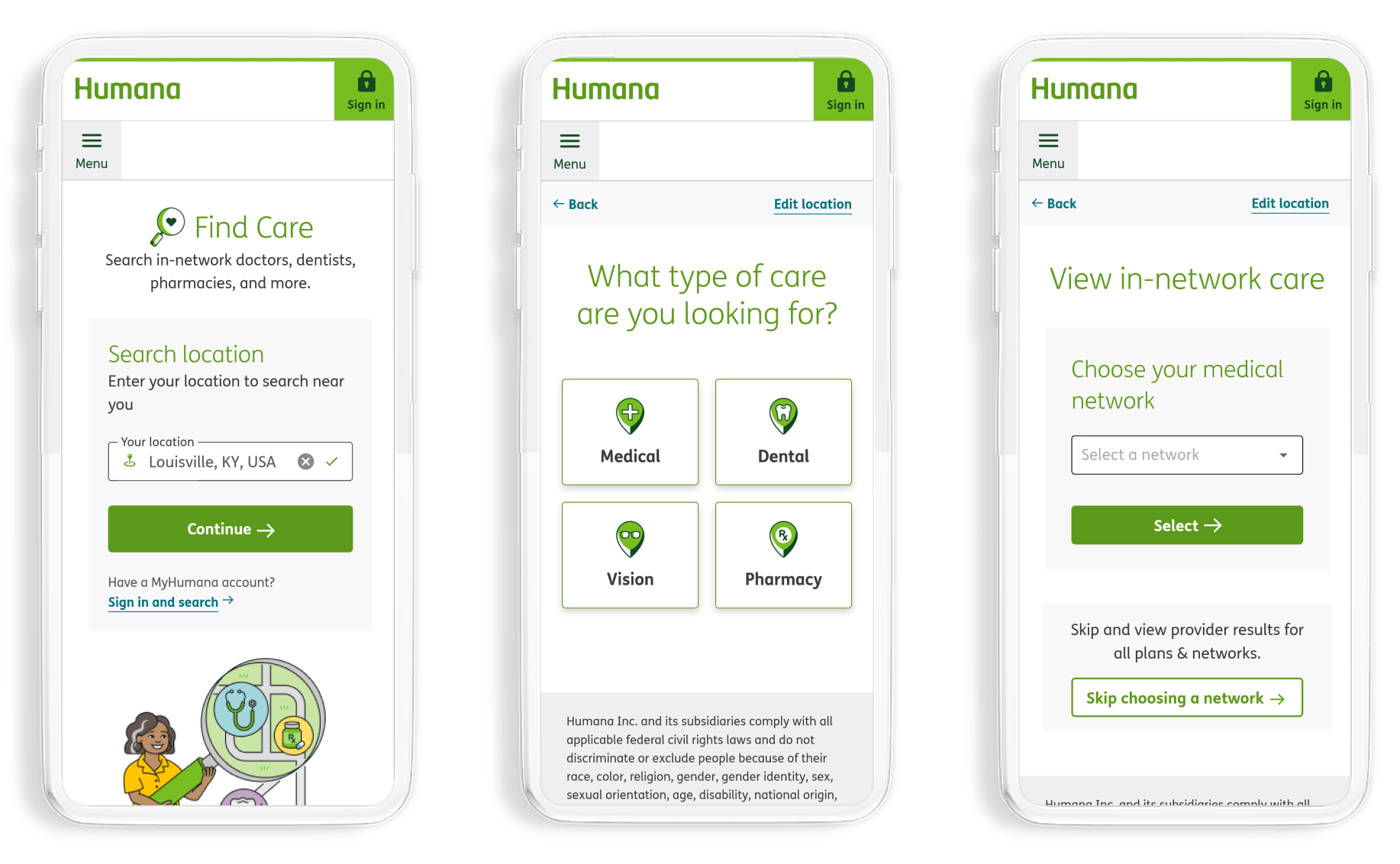
Before people can search for in-network doctors, they need to provide a location to search in and which insurance plan they have. In the legacy search tool this step was so difficult some users never even got to begin their search.
The new experience breaks the collection of this information into smaller, approachable steps. Options for filling in this information is surfaced in the moments where it matters most. Today nearly all users make it to the search page, and though the number of steps is unchanged, the percieved effort is lower.
Search, for humans
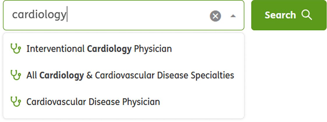
The search tool previously struggled to support the search terms people actually use. The search API required specific, clinical specialty names, and users were largely left to guess what those were. Searching for "cardiology" would return no results because the API only recognized "cardiologist," for example, but this was never communicated to users.
The new search experience needed to avoid making a finicky API the user's problem, and this was achieved by working around some of the strictness and anticipating the most common search needs.
Keywords and flexible matching
The API's dependency on particular specialties couldn't be changed in the redesign, but the lack of workarounds could.
We added hundreds of keywords and specialty groupings to allow for more flexible matching.
Now the system not only recognizes "cardiology," but also "heart doctor." These flexible search terms still map to the specialties the API expects behind the scenes, but no clinical knowledge is required of the user.
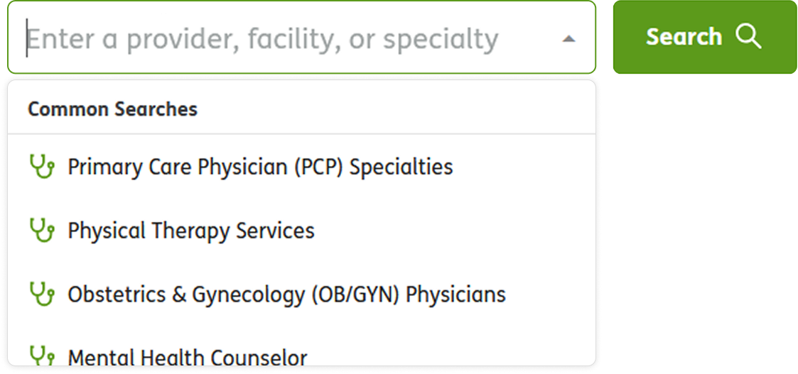
Common searches
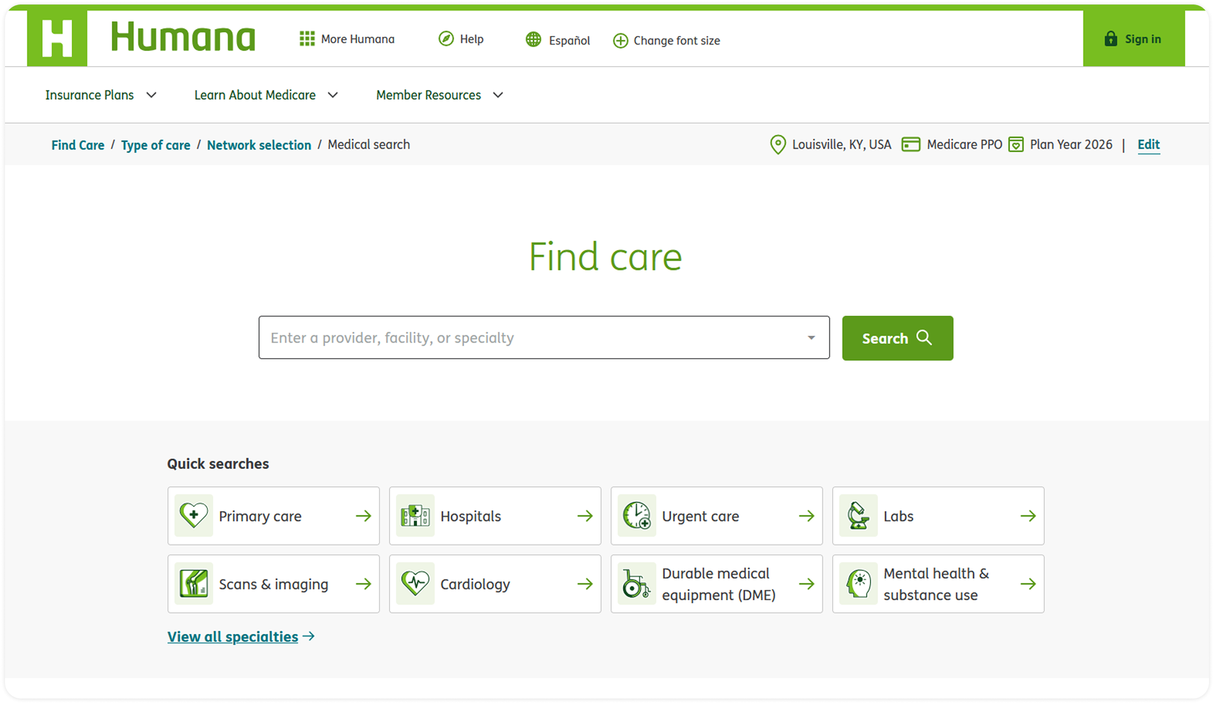
If figuring out a search term still feels daunting, now the search offers one-click ways to fill in the most common search terms before a single letter is typed.
Quick searches
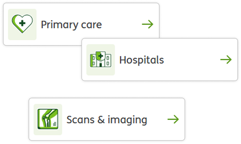
"Quick search" buttons beneath the search bar now make up 30-40% of all searches performed today.
Searches performed using these buttons are significantly more likely to get results compared to free-text searches.
This means not only are people getting through the search step quickly, but they're also getting better results.