futura zine
Print Design
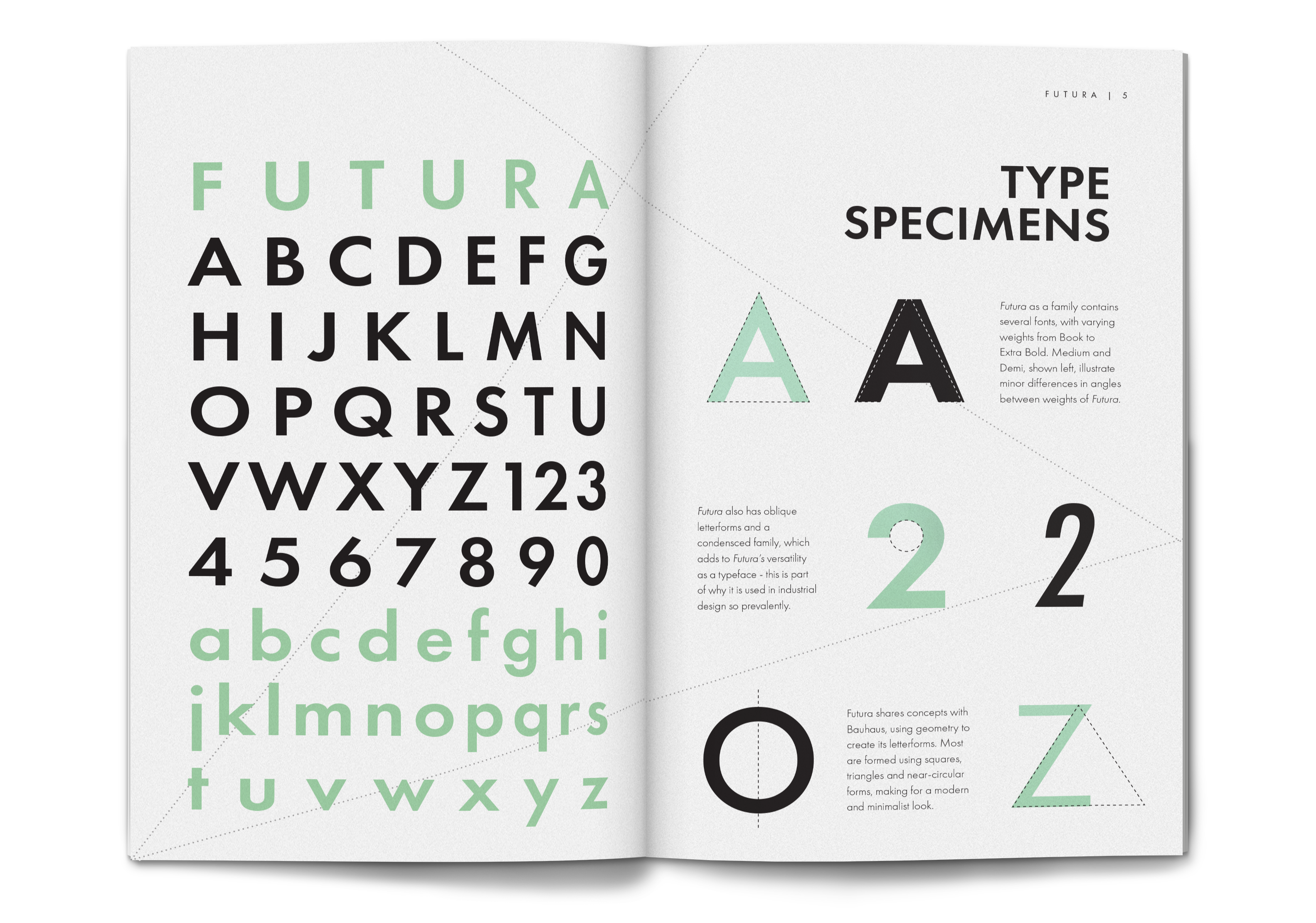
Futura Zine
Objective
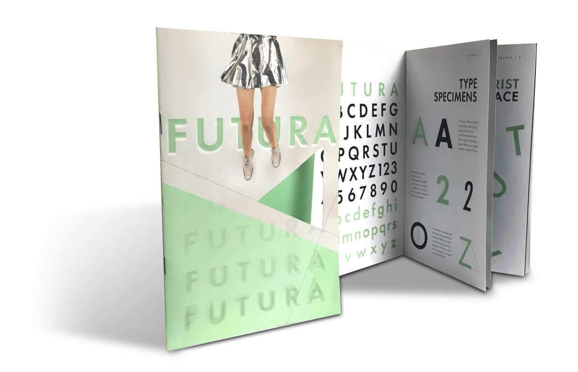
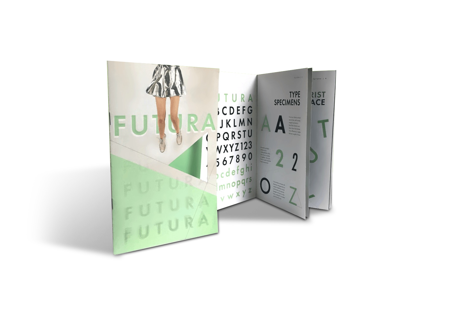
The task was to design a zine that expressed a type family, Futura, through a variety of formats, including conceptually and through a personification of the typeface. These requirements informed a sort of retro-futurism theme that unified the publication. The use of geometric shapes also tied Futura's letterforms to this retro theme on another level.
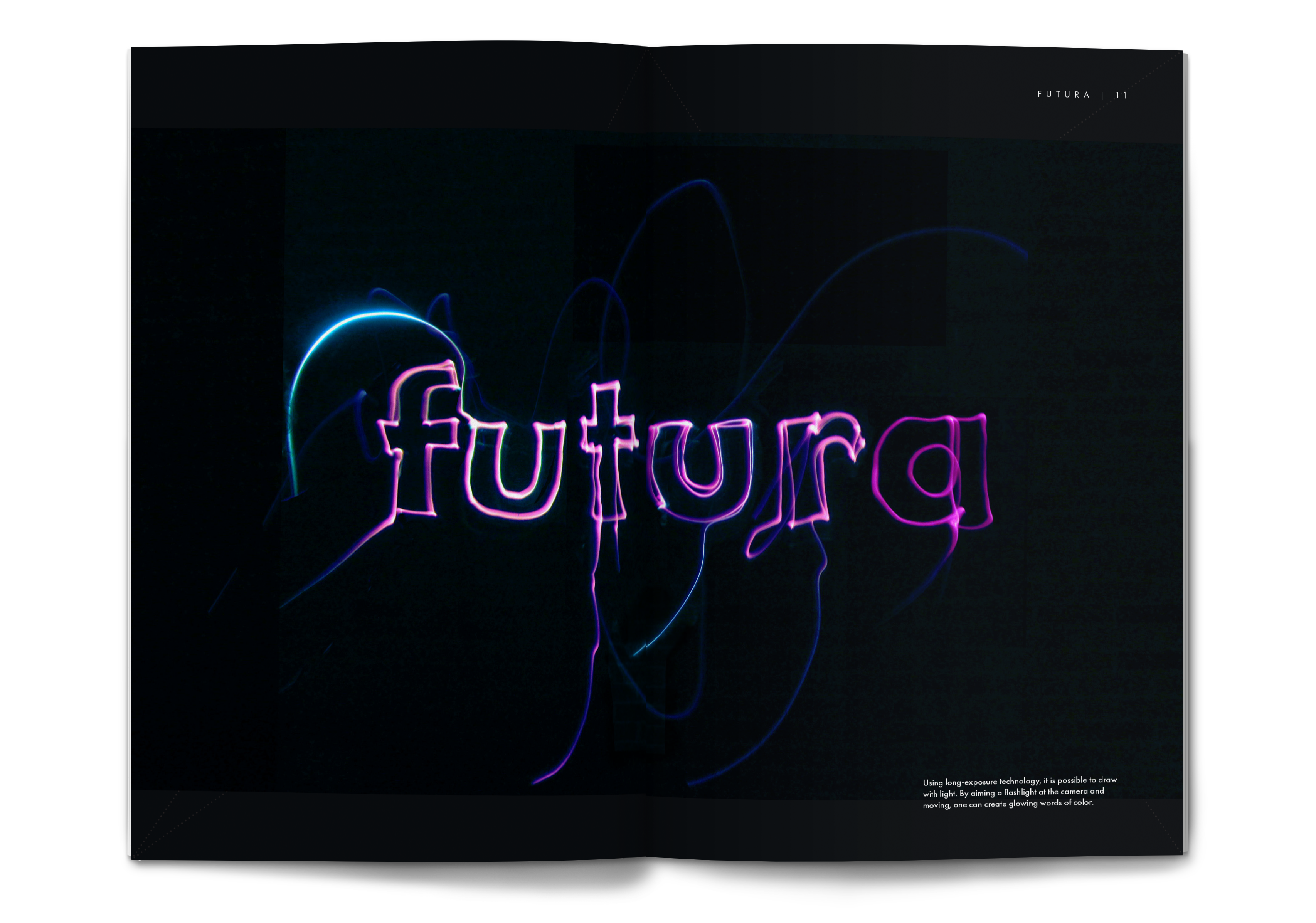
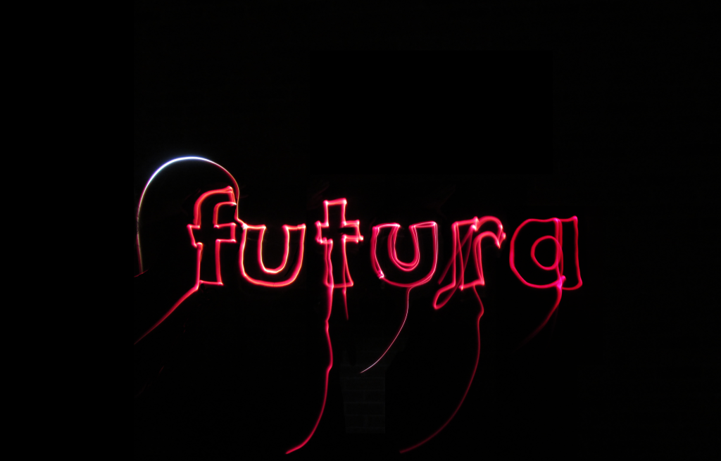
Light Writing
Futura is a typeface that was designed with an attitude that looks towards the future, and though it was created in the 1920s, it is still in widespread use to this day. This conceptual portrayal of Futura aimed to be forward-thinking as well, imagining a future where screens or paper aren't necessary for viewing typography. Although we are not in a screenless age yet, long-exposure photography can create a similarly holographic effect when light traces the letterforms.
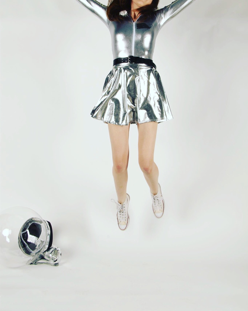
Personifying Futura
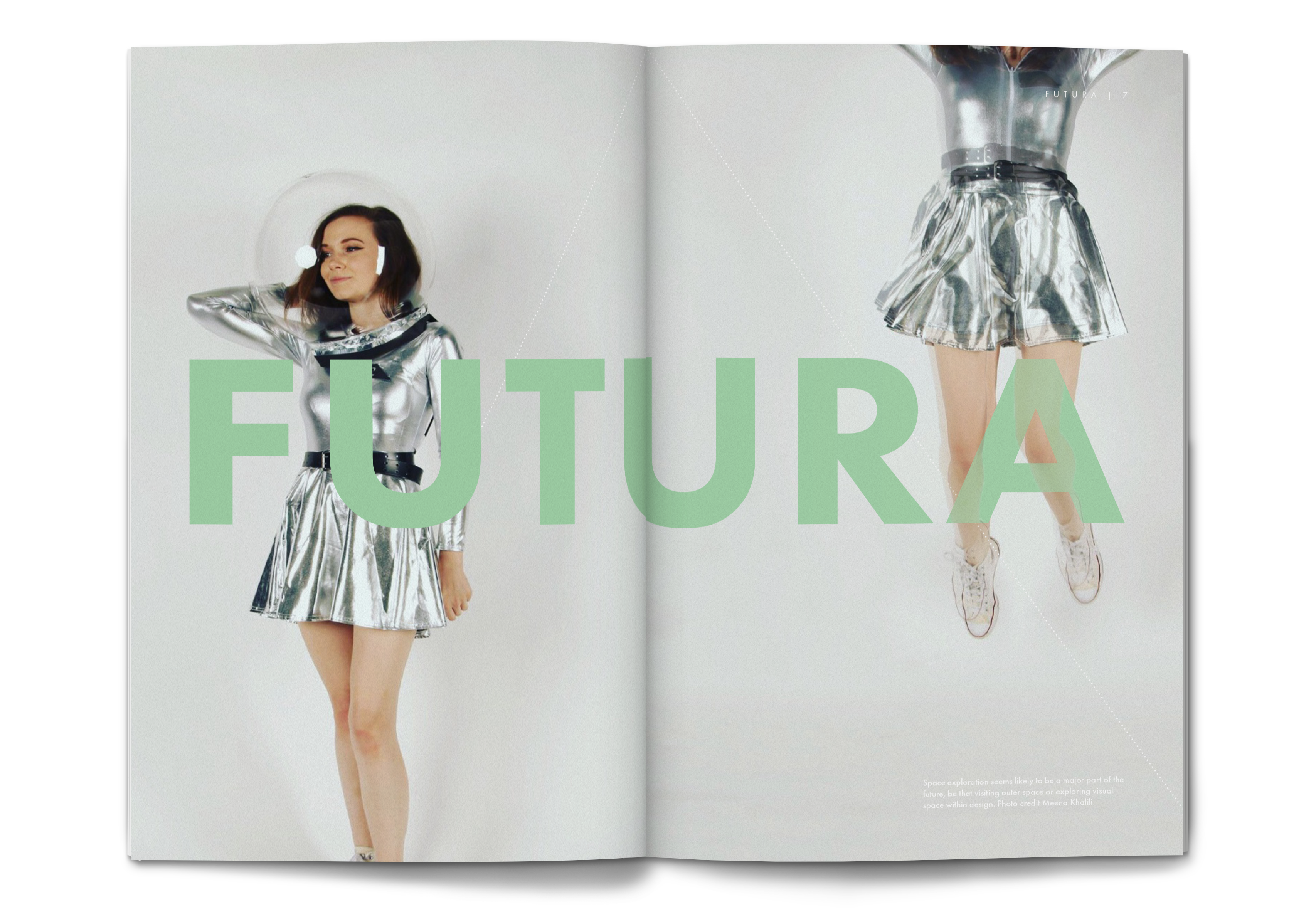
Creating the personification of Futura was another process entirely. Here the more retro side of retro-futurism came into play. The astronaut costume was designed in reference to historical ideas of what astronauts would look like, complete with a bubble-style helmet. Many retro futuristic visuals make use of sheer geometric shapes, perhaps envisioning a future where abstraction went even farther. While these pictures aren't how the future turned out, they do echo Futura's letterforms in their geometric forms.
Photo credit for the Futura personification photoshoot to Meena Khalili.
Final Design
Overall the range of requirements for the zine made for a lot of diverse content, but the use of grid throughout made it easier to unify. In situations where the imagery was dark (such as the light writing) the images were allowed to take up entire pages or spreads to increase the sense of drama as the reader turns the page.