jason submarines
Brand Identity
Jason Submarines
Objective
Jason Submarines is a fictional personal submarine startup looking to combine luxury and ecological responsibility. The brand identity designed for Jason aims to present the brand as a luxury submersible vehicle maker while also establishing the line of submarines as unique and recognizable. The design project spanned a number of media, from original submarine designs, to correspondence materials, to brand standards manual.

Concept
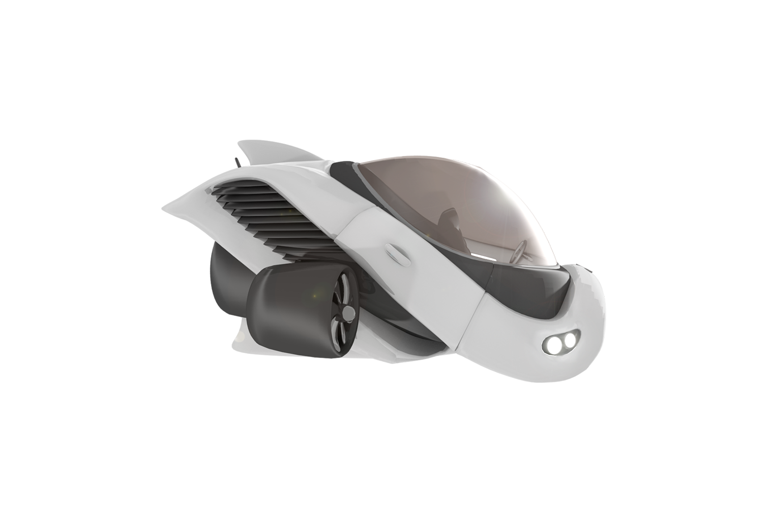
Designing for a fictitious submarine brand presented a unique challenge: the company isn't real, and thus has no images of these submarines to work with. This provided the unique opportunity to develop brand standards for the product (submarine) design as well. Similar to how various car makers have iconic elements to vehicles in their product lines, a series of essential details were incorporated into the 3D design and rendering of submarine imagery.
Process
Long before work on the submarines began, the brand started with the logo mark. The chosen mark was one of over 100 iterative sketches, but won out against other strong marks when audience members were polled. Afterwards, exploration of logo type began, eventually settling on Philosopher as a base. The appeal of this typeface is the way it balances the line between serif and sans-serif type. The font was then modified to have more curved serifs, emulating the shapes established by the logo mark.

Designing Submarines
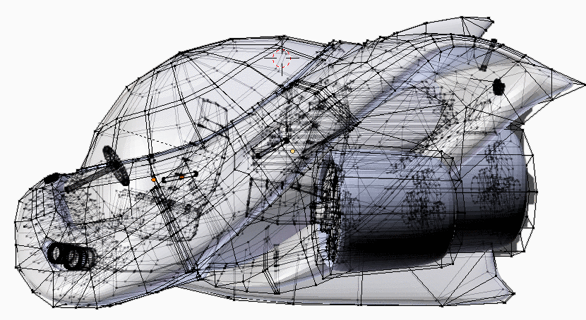
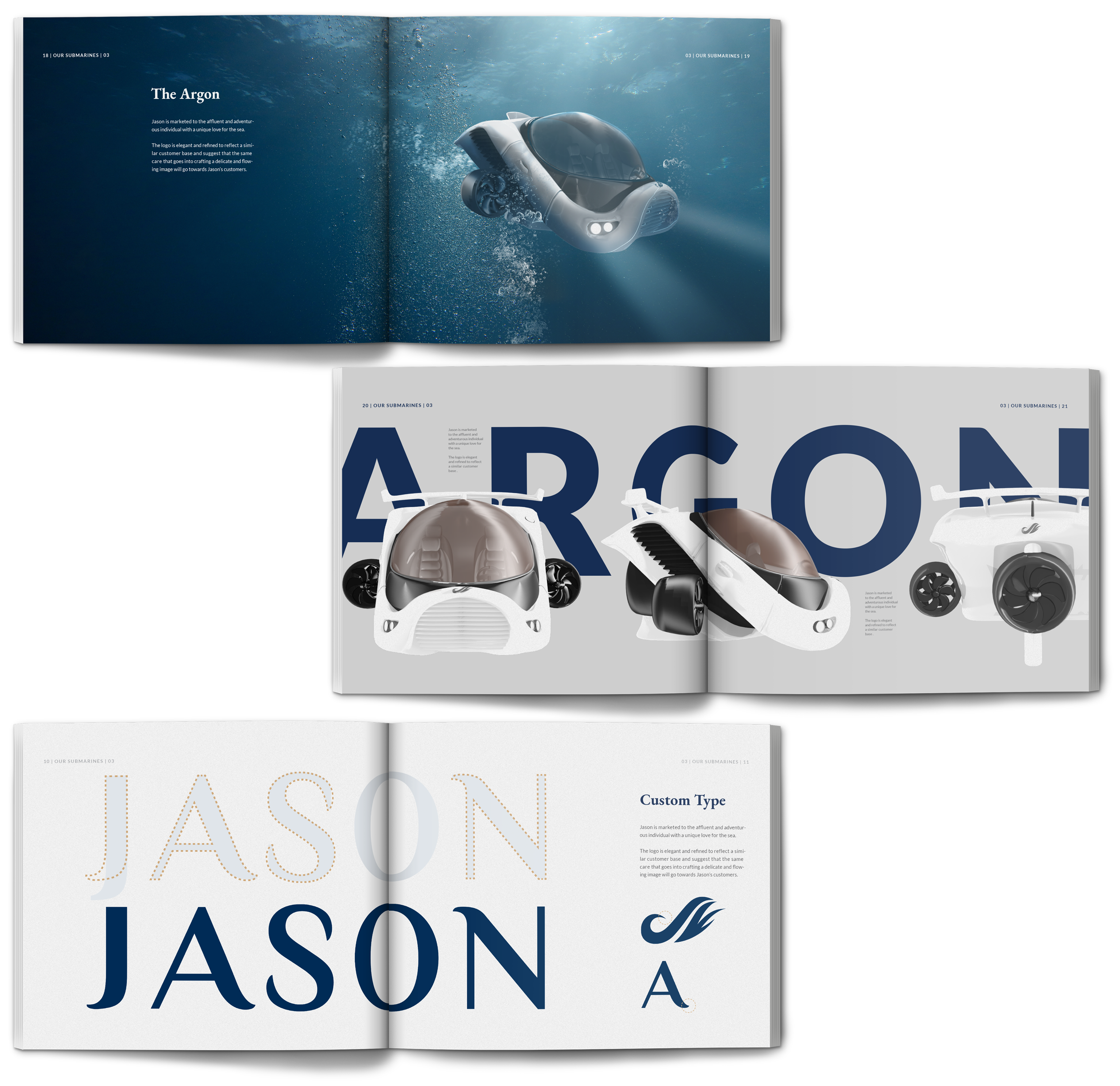
The submarines also began on paper, using the logo mark as a base for the profile design. The curved and looping aspects made for an easy transition to an intake grill on the front, and many other elements came naturally as well. The sketch was then moved into Blender and gradually turned into a 3D mesh. As materials started being assigned, considerations had to be made for a submarine-customizing section of the website. It needed to be possible to change various colors and create multiple renders to show all the possible options, so materials were separated carefully, and then over 100 renders were generated.
Final Design
Ultimately, while creating submarines took some time, having the ability to generate any imagery needed saved time on editing and made for high levels of consistence in materials for the brand. Having renders with minimal backgrounds helped accentuate the sense of luxury and cleanliness the brand was aiming for. Personal submarines might not be a common product, but by utilizing a similar visual language to that of luxury cars (seeing propellers as wheels, keeping headlights in a similar place), the advertisements became something more familiar (and hopefully trustworthy) to the average person.