mrs eaves poster
Print Design
Mrs Eaves Poster
Objective
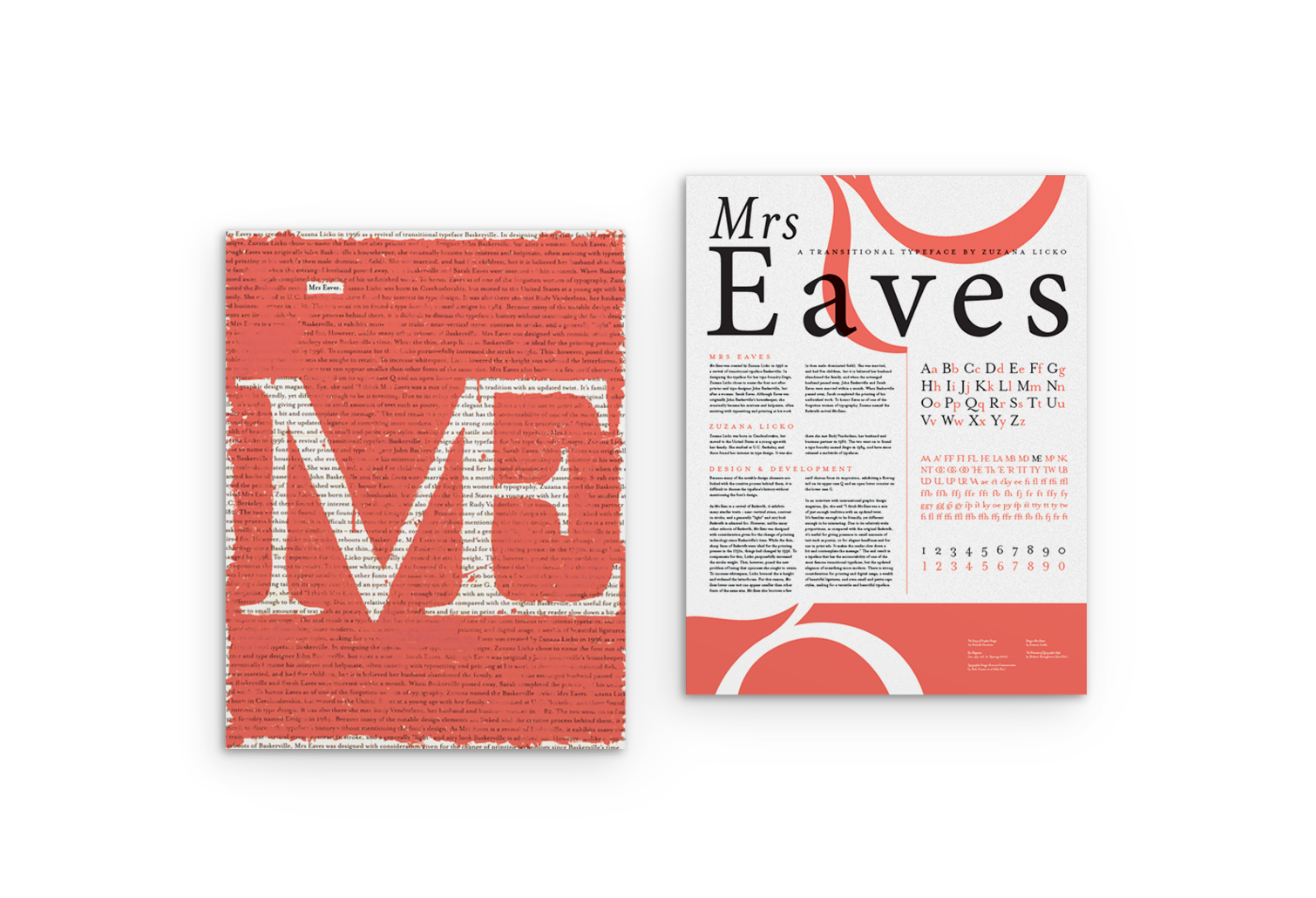
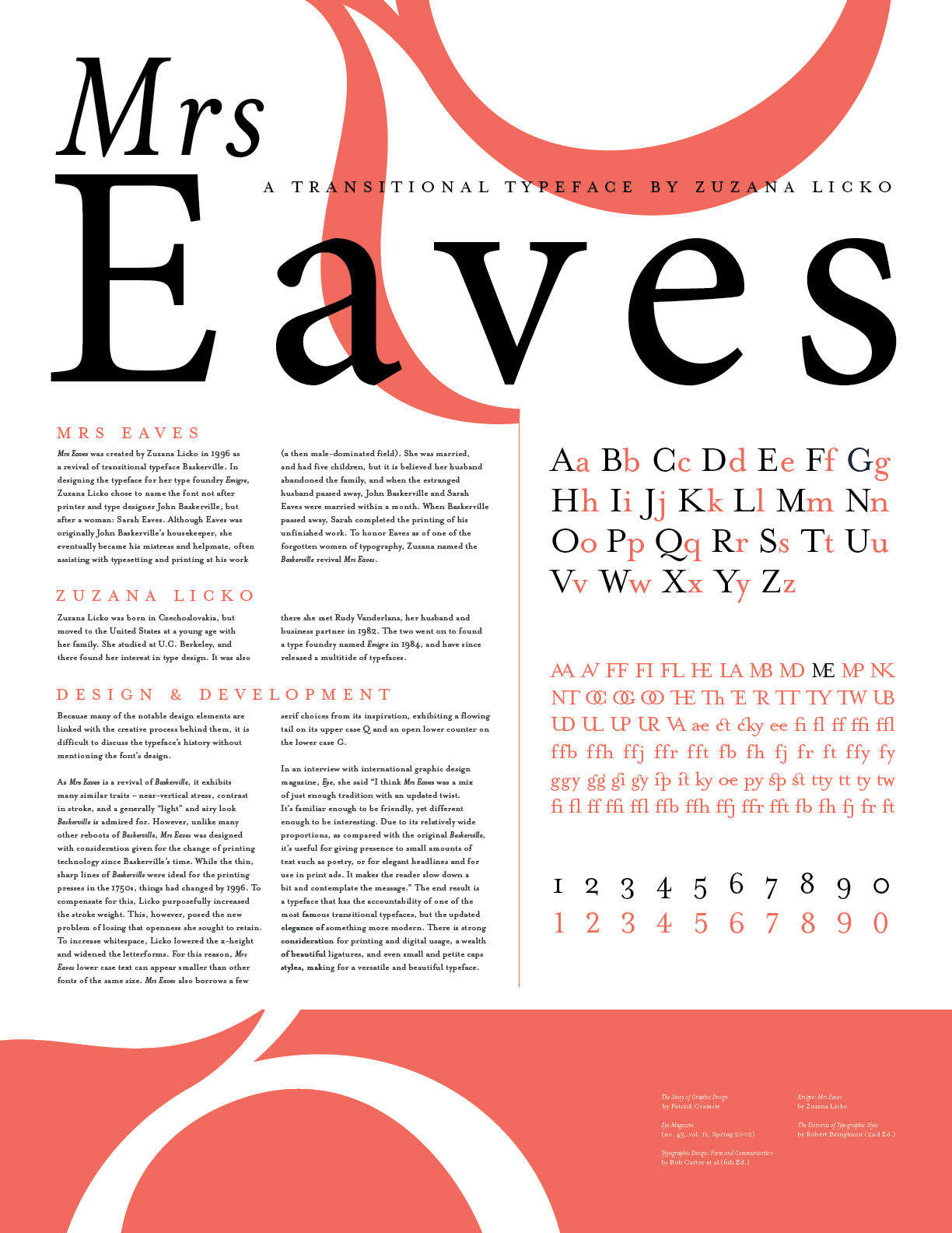
Mrs Eaves is a transitional serif typeface designed by Zuzana Licko of Emigre. The typeface is based on Baskerville with some more "feminine" curves and quirks added in, and named to honor one of the first women in graphic design and printmaking, Sarah Eaves. This poster design had a simple limitation: it must be double sided, with one side informational and the other conceptual.
Work
Exhibited
Cressman Center for Visual Arts 2018
Concept
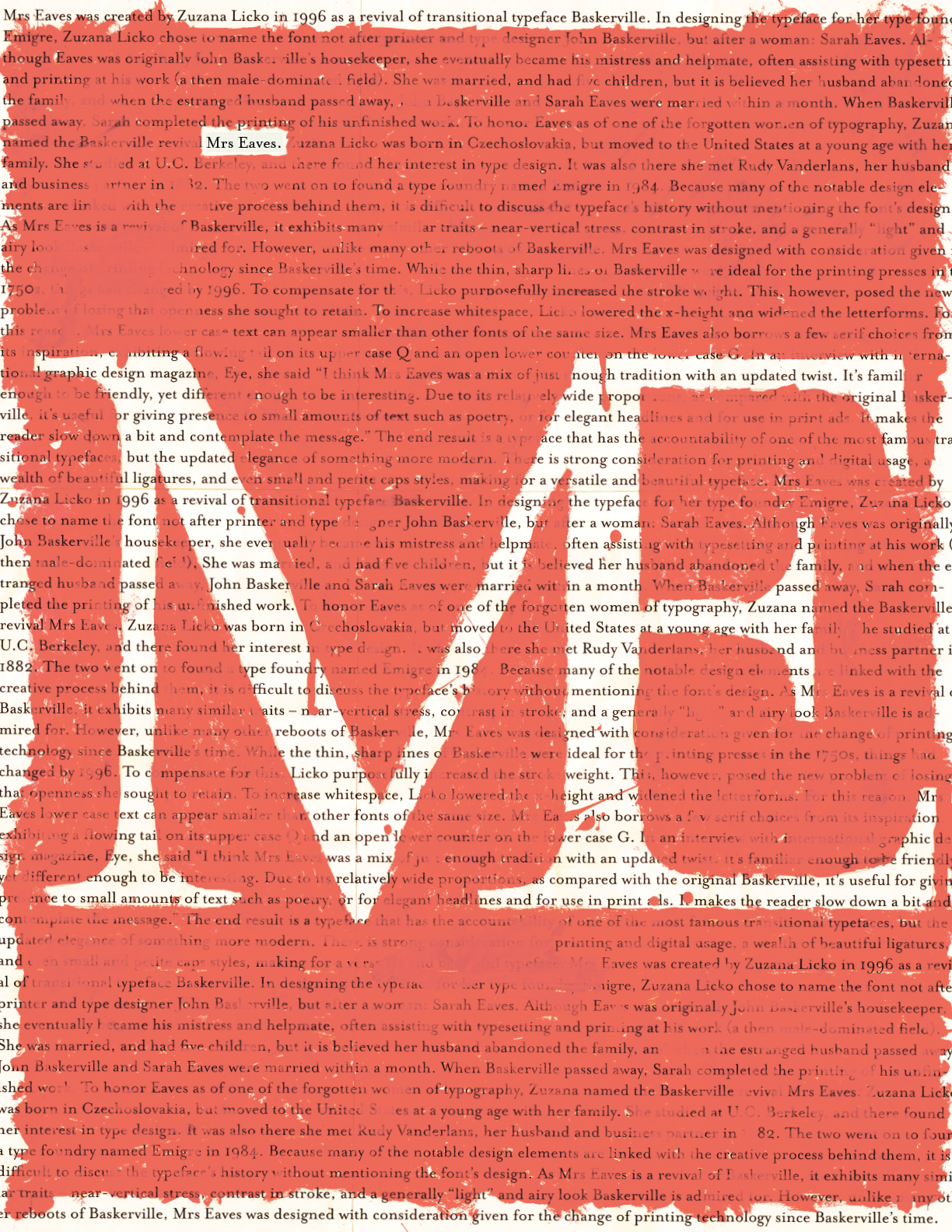
The informational side was relatively straightforward to design, as it made heavy use of a grid to inform the layout. The conceptual side, however, was more of a challenge. The final concept sought to unify the typeface's intentional design for print, its impressive number of ligatures, and its intent to honor women in graphic design.

Process
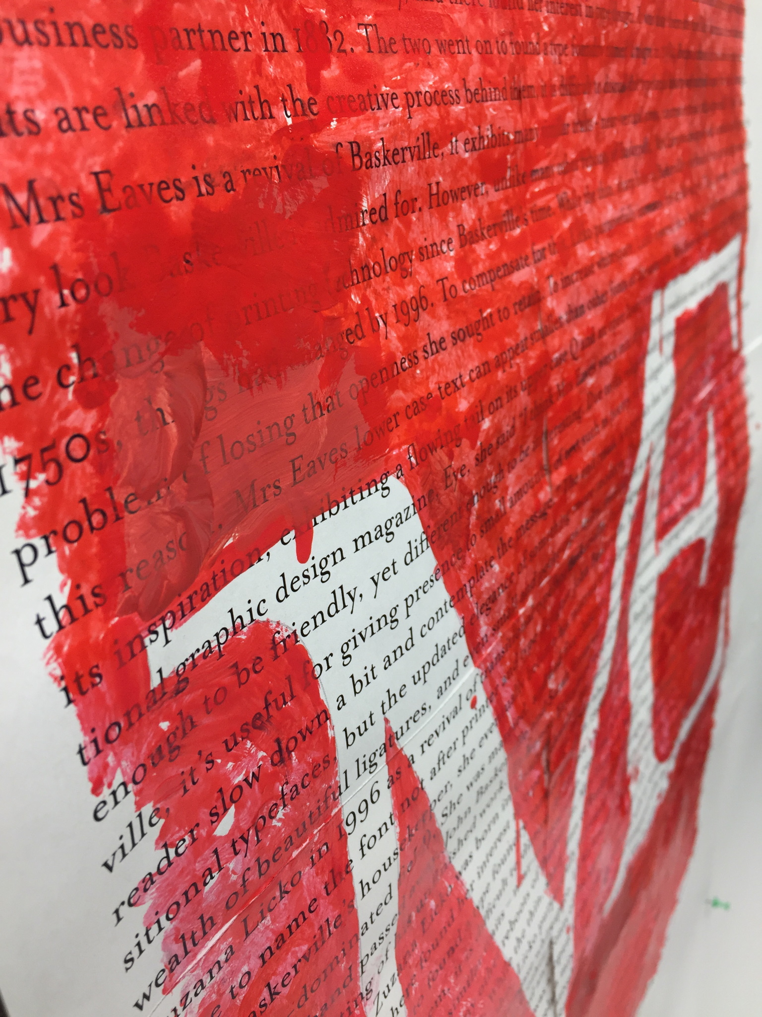
To create the conceptual side, the written content from the informational side was scaled up and printed out (as Mrs Eaves was designed for print). This printed out and pasted-together poster was then nearly entirely covered in pink nail polish, leaving only a ligature of "M" and "E" and the name they stand for, Mrs Eaves, in the negative space. On the informational side, where the ligatures are listed the "M" and "E" ligature is black, rather than pink, a faint echo of the conceptual side in a more ordered layout.
After the nail polished dried, the entire piece was scanned back into digital format by some cooperative (but confused) people at Staples and later printed on the final, double-sided poster.